Accordions
Accordions help editors organize content into collapsible sections. This helps reduce the length of a page and allows people to read only the content they are interested in. Accordions contain other blocks, so layouts can be adjusted to suit the content. They are particularly useful for FAQs.
System ref: ACCORDION GROUP BLOCK
2.0 Layout/Organization
- 2.1 Columns
- 2.2 Accordions
- 2.3 Tabs
- 2.4 Separators
Accordion Sample

Lorem ipsum dolor sit amet, consectetur adipiscing elit. Suspendisse eleifend mattis augue at euismod. Fusce ut leo eros. Etiam pulvinar dui nec mauris tincidunt, non volutpat augue auctor. Praesent at auctor sem. Aliquam pharetra comit.
Fusce ut leo eros. Etiam pulvinar dui nec mauris tincidunt, non volutpat augue auctor. Praesent at auctor sem. Aliquam pharetra condimentum turpis, sed ultrices ipsum venenatis non. Aliquam volutpat turpis neque.

Accordion group settings
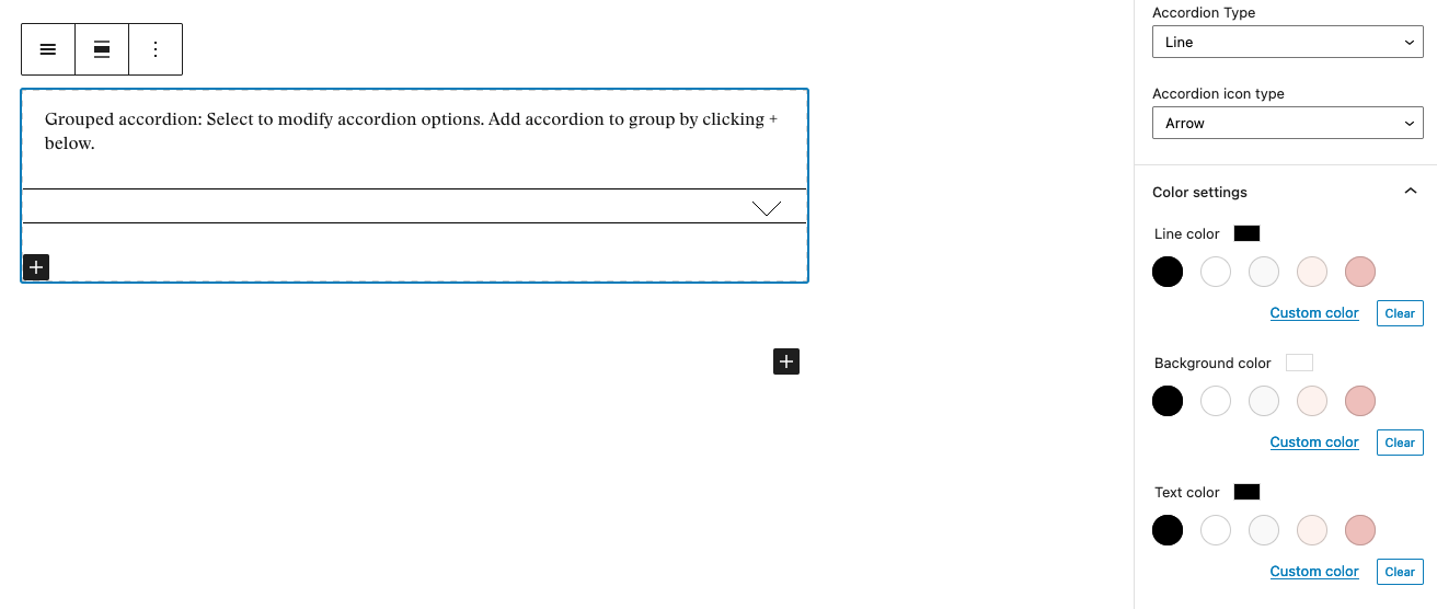
When you add an Accordion Group block, you can adjust the design of the accordions as well as the content within them. To adjust the design of the accordions, open the Block Settings tab on the right and change the settings as needed. Note: These settings will apply to all accordions in your group.
Settings Options
- Accordion Type: This field allows you to choose two styles for your accordions – line and block. The line option gives the accordion an outline. The block option gives the accordion a solid block of color along the top header. Your selection here will influence what other settings are available to you.
- Accordion Icon Type: This field allows you to choose the icons used on the accordion’s open/close function. You can choose from an arrow or plus/minus symbols.
- Line Color: This is available for the line accordion type. This allows you to select the color for the line around the accordion.
- Background Color: This is available for the line accordion type. This allows you to select the background color for the accordion.
- Text Color: This is available for the line accordion type. This sets the color for all the text and icons.
- Header Background Color: This is available for the block accordion type. This allows you to select the background color for the accordion’s header.
- Header Text Color: This is available for the block accordion type. This lets you to set the text color for the accordion’s header.
- Body Background Color: This is available for the block accordion type. This allows you to select the background color for the main text area of the accordion.
- Body Text Color: This is available for the block accordion type. This sets the text color for the main text area of the accordion.
When choosing colors, consider the colors used on the rest of the site and make sure that your color choices meets AA accessibility standards.
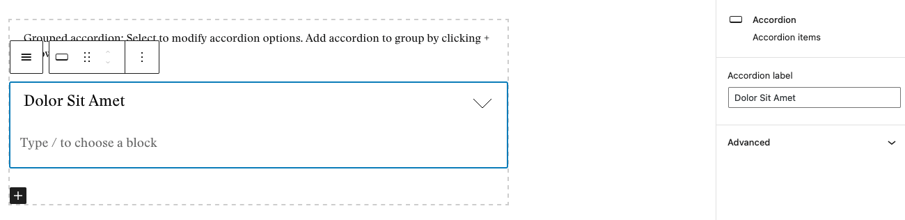
When you are ready to add content, click into an accordion. On the Block Settings tab, add the heading for the accordion in the Accordion Label field. Within the block editor, add content blocks to create the layout, and add text and images as needed. You can add more accordions using the plus symbol in the bottom-left corner of the block.