Overlay Image
Overlay images allow authors to add dynamic overlays to image blocks. Headlines, sub copy and images can all be added as full height or 50% overlays. Editors can control overlay color, text, and opacity. Editors can also choose whether or not to include a call-to-action (CTA) prompt in their overlay.
System ref: GSD OVERLAY
Overlay Image Samples
Simple Text Overlay
Settings: 70% opacity/Full height


Image Overlay
Settings: Full height

Text with CTA
Settings: 100% opacity/Half height

Image Overlay
Settings: Full height


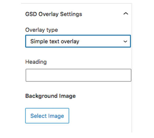
GSD Overlay Settings
The GSD Overlay block includes three types of overlays – Simple Text overlay, Text with CTA overlay, and Image overlay. All the settings are located in the Block Settings tab on the right-hand side. In the examples above, the GSD Overlay block has been set into two-column and three-column blocks to achieve the layout.
It is important to note that mobile and tablet users cannot access hover states, so they will only see the overlay if they click on the image. Because of this, use the overlay to present supplemental information, not essential information.
Setting Options
- Overlay Type: Select what type of overlay you want from the dropdown. This should be chosen first since the rest of the settings will change accordingly.
- Heading: Available in the Simple Text and Text with CTA overlays. Add the main heading for the overlay.
- Text: Available in the Text with CTA overlay. Include 1-2 sentences of text about the image.
- CTA Text: Available in the Text with CTA overlay. Add the link text in this field. To add the link URL, use the link icon in the block toolbar. Leave this field empty if you do not want the CTA to appear.
- Background Image: Available on all overlay types. This is the main image for the block.
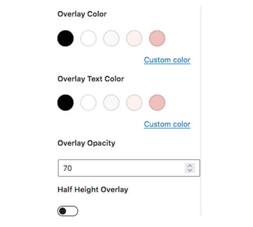
- Color: Available in the Simple Text and Text with CTA overlays. You can customize the overlay color (background) and overlay text color. When choosing the color palette, consider the colors used on the rest of the site and make sure that your color choices meet AA accessibility standards.
- Overlay Opacity: Available in the Simple Text and Text with CTA overlays. This controls the opacity level of the overlay color (background color). This is set as a percentage. Avoid reducing the opacity to a degree that it is difficult to read the text.
- Half Height Overlay: Available on the Simple Text and Text with CTA overlays. Turn this on if you want the overlay to only cover half the height of the image. On mobile devices, this overlay may cover more than half the image height, depending on how much text there is.
- Overlay Image: Available on Image overlay only. This is the image that will appear when a user hovers over the block. For best results, keep your overlay image the same size as the background image.