Buttons
The Buttons block allows editors to add clickable buttons to their page. Buttons are more prominent than links, and are used for the main calls-to-action on a page.
System ref: Buttons
3.0 Text
- 3.1 Headings
- 3.2 Body Copy
- 3.3 Button
- 3.4 Quotation
Button Samples
Buttons Settings
When you insert a Buttons block on your page, you can add multiple buttons, adjust the style of each button, edit the text, and add links. Try to keep your buttons looking consistent throughout your site. Consider using a primary button style for your main calls-to-action, and a secondary button style for less important calls-to-action. Keep your button text short, ideally between 1-4 words.
Setting Options:
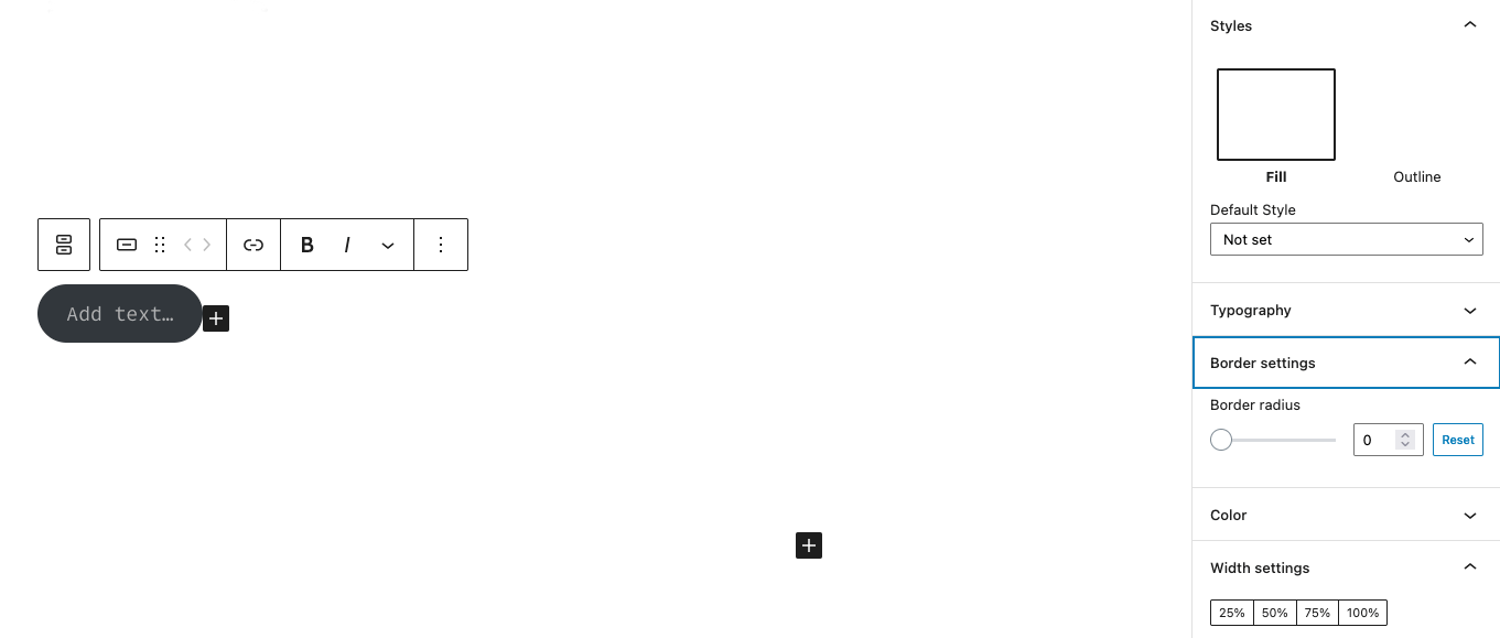
- Add Text: When you create a new button, add your button text here.
- Link: Click on the link icon in the block toolbar. Search for your URL or paste a URL into the pop up, then submit your selection.
- Style: This is found in the Block Settings tab on the right-hand side. You can choose two styles: Fill (the button has a background color) and Outline (the button has an solid line around it and a transparent background).
- Border settings: This is found in the Block Settings tab on the right-hand side. This will allow you to adjust the radius of the button’s corners. For square buttons, set this to zero. The higher you go, the more round your button’s corners will be.
- Color: This is found in the Block Settings tab on the right-hand side. You can customize the background color and text color of your button. When choosing the color palette, consider the colors used on the rest of the site and make sure that your color choices meet AA accessibility standards.
- Width Settings: This is found in the Block Settings tab on the right-hand side. You can set your button width to a certain percentage of the screen. If you do not make a selection, then your button will expand to accommodate the amount of text within it. On mobile devices, all buttons will span the width of the screen, regardless of your width settings.
- Transform to Variation: If you add more than one button, you can decide whether or not your buttons will sit next to each other horizontally, or if they will stack vertically. To make this choice, click into the Buttons block instead of an individual button. In the Block Settings on the right, open the dropdown and make your selection.
To add additional buttons within the Buttons block, place your cursor at the end of the button text and hit the enter key. Alternatively, use the plus icon located at the bottom-right corner of the block.