Tabs
Tabs allow editors to organize their content into different sections that will only be displayed one at a time. Tabs can contain a variety of other blocks from the system. When using the Tab block make sure to assign each tab a unique Tab ID (which is hidden from users) and assign the content within your layout a matching Tab ID.
System ref: TABS
2.0 Layout/Organization
- 2.1 Columns
- 2.2 Accordions
- 2.3 Tabs
- 2.4 Separators
Tab Samples
Cras ut neque ex. Nullam vulputate egestas auctor. Sed mollis dolor ac malesuada fringilla. Morbi luctus accumsan maximus. Sed facilisis gravida felis nec facilisis. Nulla tristique lorem non nulla iaculis, in venenatis ligula tincidunt. Nam pellentesque mauris sit amet pulvinar molestie. Proin mauris purus, feugiat id ante molestie, feugiat placerat erat. Sed eu ligula ut lectus luctus tincidunt.
Cras ut neque ex. Nullam vulputate egestas auctor. Sed mollis dolor ac malesuada fringilla. Morbi luctus accumsan maximus. Sed facilisis gravida felis nec facilisis. Nulla tristique lorem non nulla iaculis, in venenatis ligula tincidunt. Nam pellentesque mauris sit amet pulvinar molestie. Proin mauris purus, feugiat id ante molestie, feugiat placerat erat. Sed eu ligula ut lectus luctus tincidunt.
Cras ut neque ex. Nullam vulputate egestas auctor. Sed mollis dolor ac malesuada fringilla. Morbi luctus accumsan maximus. Sed facilisis gravida felis nec facilisis. Nulla tristique lorem non nulla iaculis, in venenatis ligula tincidunt. Nam pellentesque mauris sit amet pulvinar molestie. Proin mauris purus, feugiat id ante molestie, feugiat placerat erat. Sed eu ligula ut lectus luctus tincidunt.
Cras ut neque ex. Nullam vulputate egestas auctor. Sed mollis dolor ac malesuada fringilla. Morbi luctus accumsan maximus. Sed facilisis gravida felis nec facilisis. Nulla tristique lorem non nulla iaculis, in venenatis ligula tincidunt. Nam pellentesque mauris sit amet pulvinar molestie. Proin mauris purus, feugiat id ante molestie, feugiat placerat erat. Sed eu ligula ut lectus luctus tincidunt.
Cras ut neque ex. Nullam vulputate egestas auctor. Sed mollis dolor ac malesuada fringilla. Morbi luctus accumsan maximus. Sed facilisis gravida felis nec facilisis. Nulla tristique lorem non nulla iaculis, in venenatis ligula tincidunt. Nam pellentesque mauris sit amet pulvinar molestie. Proin mauris purus, feugiat id ante molestie, feugiat placerat erat. Sed eu ligula ut lectus luctus tincidunt.
Cras ut neque ex. Nullam vulputate egestas auctor. Sed mollis dolor ac malesuada fringilla. Morbi luctus accumsan maximus. Sed facilisis gravida felis nec facilisis. Nulla tristique lorem non nulla iaculis, in venenatis ligula tincidunt. Nam pellentesque mauris sit amet pulvinar molestie. Proin mauris purus, feugiat id ante molestie, feugiat placerat erat. Sed eu ligula ut lectus luctus tincidunt.
Cras ut neque ex. Nullam vulputate egestas auctor. Sed mollis dolor ac malesuada fringilla. Morbi luctus accumsan maximus. Sed facilisis gravida felis nec facilisis. Nulla tristique lorem non nulla iaculis, in venenatis ligula tincidunt. Nam pellentesque mauris sit amet pulvinar molestie. Proin mauris purus, feugiat id ante molestie, feugiat placerat erat. Sed eu ligula ut lectus luctus tincidunt.
Cras ut neque ex. Nullam vulputate egestas auctor. Sed mollis dolor ac malesuada fringilla. Morbi luctus accumsan maximus. Sed facilisis gravida felis nec facilisis. Nulla tristique lorem non nulla iaculis, in venenatis ligula tincidunt. Nam pellentesque mauris sit amet pulvinar molestie. Proin mauris purus, feugiat id ante molestie, feugiat placerat erat. Sed eu ligula ut lectus luctus tincidunt.
Cras ut neque ex. Nullam vulputate egestas auctor. Sed mollis dolor ac malesuada fringilla. Morbi luctus accumsan maximus. Sed facilisis gravida felis nec facilisis. Nulla tristique lorem non nulla iaculis, in venenatis ligula tincidunt. Nam pellentesque mauris sit amet pulvinar molestie. Proin mauris purus, feugiat id ante molestie, feugiat placerat erat. Sed eu ligula ut lectus luctus tincidunt.
Tab settings
When you add an Tab block to the page, you can adjust the style of the tabs and update content within them.
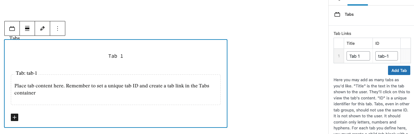
In order to add another tab, you must take the following steps:
- Create the Tab Content Container: Click on the plus icon in the lower left-hand corner of the block. This will add another tab where you can place content.
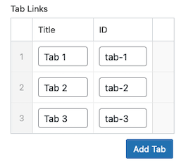
- Add Identifiers: In the Block Settings on the right-hand side, add another Tab Link using the Add Tab button.
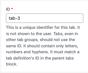
- Edit the Tab Title and ID: Each tab must have a unique Title and ID. The Title is what users will see when they look at the tabs. The ID is what nestles the content into a specific tab.
- Assign the Tab ID: Return to the main editor and click into the individual tab that you’ve set up. In the Block Settings, a field labeled ID will appear. Replace tab-1 with the ID you’ve just created for your new tab.
Once you’ve set up your tab structure and have assigned the Title and ID, you are ready to style your tabs. Select the Tab block and open up the Block Settings on the right-hand side. Open the Styles accordion and choose the following:
- Tab Style: There are three style options for your tabs – Default, Underline, and Highlighter. Examples of each style are shown above.
- Background Color: This allows you to select the background color for the tab.
- Text Color: This lets you to set the text color for the tab.
When choosing colors, consider the colors used on the rest of the site and make sure that your color choices meets AA accessibility standards.
When you are ready to add content, click into a tab. Within the block editor, add content blocks to create the layout, and add text and images as needed. You can add more tabs using the plus symbol in the bottom-left corner of the block.
You may add as many Tab blocks as you want on the page, however each tab title and tab ID must be unique across all the Tab blocks.