Hero Banner
A hero banner is used to highlight the key message(s) on a page. There are two hero banners available in this system – a static Hero Banner block and a Hero Carousel block that contains a slider with multiple banners. Each block includes options to change styles, images, text, buttons, and layout. You may only use each banner once per page.
System ref: Hero Banner
Hero Banner Samples

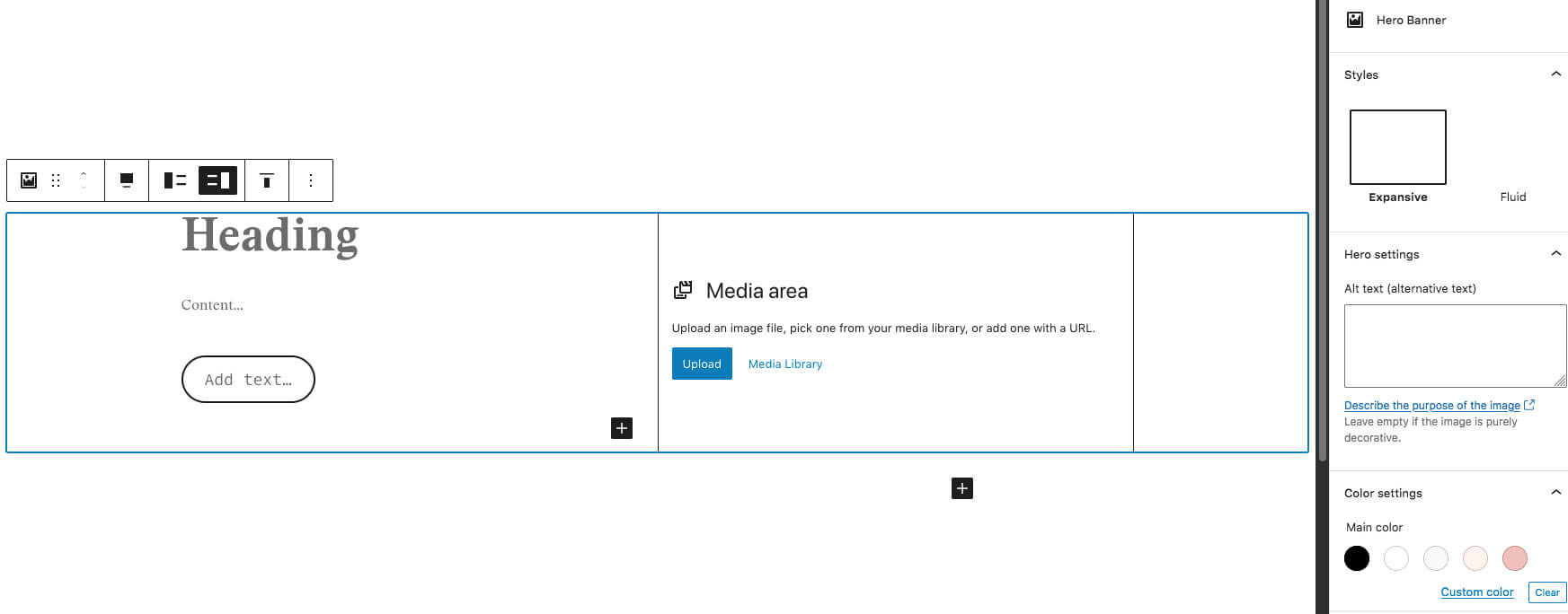
Hero Banner
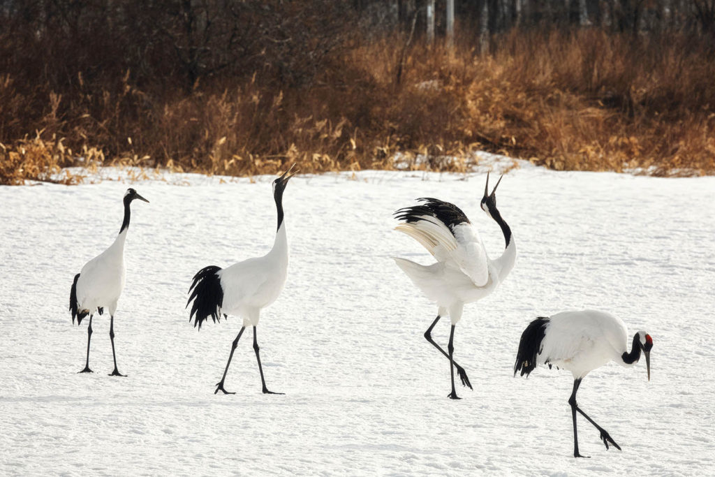
In this example, the hero banner style is set to fluid and the image is centered vertically and right-aligned. You can include text in this area, as well as an optional button below.
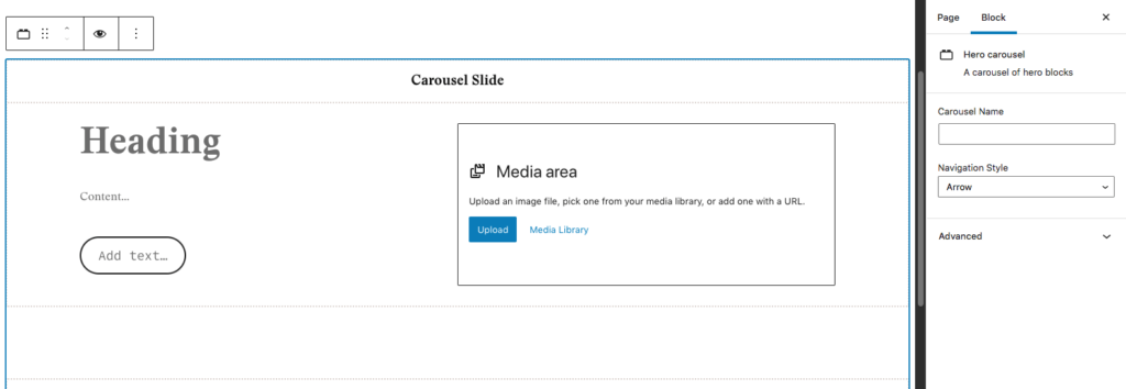
Hero Carousel
In this hero, you can add multiple images with text, that users can view by using the left/right arrows or the dots. On this slide, the image is left-aligned and the text is centered vertically.

Hero Carousel 2
This is the second slide in the Hero Carousel. In this slide the image is right-aligned and the text is centered vertically.
Hero Carousel 3
This is the third slide in the Hero Carousel. In this slide the image is right-aligned and the text is aligned to the bottom. The optional button has been left empty so it does not appear.
Hero Banner Settings
This block is made of up a static banner that includes a heading, text, image, and an optional button. Once you’ve added the Hero Banner block, you will need to adjust settings in the editor, the block toolbar, and the block settings panel on the right-hand side of your screen.
Setting Options:
- Block Settings: On the right-hand side in the Block Settings tab, you can choose whether this block uses an expansive or fluid layout. An expansive layout keeps the image on top of the background color, while the fluid layout (shown in the example on this page) offsets the image from the background color. You can also customize the main color (text) and background color. When choosing the color palette, consider the colors used on the rest of the site and make sure that your color choices meet AA accessibility standards.
- Block Toolbar: The block toolbar allows you to select left or right alignment for the image. You can also select vertical alignment (top, centered, or bottom).
- Heading: Add the banner’s heading here. This is the title for the banner and should be short (ideally 2-5 words).
- Content: The main content for the banner. Try to keep this to 2-4 sentences. If more information is needed, consider using the optional button to send users to a page with more details.
- Button (optional): Add the text for the button and add a link using the button’s toolbar. Leave the button field empty if you do not want it to appear.
- Media Area: Upload an image file or choose one from your media library. Remember to add alt text to the image in the Block Settings panel on the right-hand side.
Hero Carousel settings
This block allows you to create multiple hero banners that are grouped together in a slider. Statistically, most users will not click beyond the first banner, so use that for your most important message. The block will start with two banners. If you want to add more, select the block and click the plus sign in the bottom left corner below the second banner.
Setting Options:
- Block Settings: On the right-hand side in the Block Settings tab, you can add a name for the carousel (optional), and adjust the navigation style to arrows, dots, or both.
- Heading: Add the banner’s heading here. This is the title for the banner and should be short (ideally 2-5 words). You should have a different heading for each banner in your carousel.
- Content: The main content for the banner. Try to keep this to 2-4 sentences. If more information is needed, consider using the optional button to send users to a page with more details. You should have different content for each banner in your carousel.
- Button (optional): Add the text for the button and add a link using the button’s toolbar. Leave the button field empty if you do not want it to appear. Each banner can have a different button.
- Media Area: Upload an image file or choose one from your media library. Remember to add alt text to the image in the Block Settings panel on the right-hand side. You will need to fill this in for each banner in your carousel. The carousel height is controlled by the height of your tallest image, so keep the image sizes consistent across all your banners to avoid layout problems.